 Your colour choices can have a big impact on not only the look and feel of your rooms, but also over your mood as you spend time in your home.
Here are some of the common effects of colour on your mood, and how to match it to each room in your home.
Blue
Blue provides a sense of calmness. It’s often used in offices as it stimulates clear thinking and promotes productivity. Too much blue can make a room boring or cold, so it’s good to balance blue rooms with some contrasting colours like yellow or white.
Ideal room: Office.
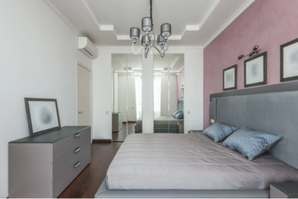
Green
Green represents good health, nature and money. It’s a peaceful colour that is easy for the eyes to process and can provide a sense of tranquillity and well-being.
Ideal room: Bedroom.
Yellow
Yellow can brighten a room substantially, giving off energy and vitality. When used sparingly, it can make a room exciting and uplifting.
Ideal room: Kitchen, Bathroom.
Red
Red is one of the more evocative and bold colours, symbolising passion and intensity. Some people suggest it can even raise a person’s heart rate and blood pressure. Red is often used in restaurants as it can stimulate a person’s appetite. It’s no wonder many food chains use this colour in their logos.
Ideal room: Dining room.
Orange
Orange is an exciting, playful and friendly colour that promotes enthusiasm. Similar to yellow, it can help boost energy levels but should not be overused. It is often linked with fitness to help give energy during workouts.
Ideal room: Fitness room/Gym.
Purple
Purple is a luxurious and dramatic colour that can boost creativity. It can often be too dramatic to be used as the sole colour for a room, but it is an effective secondary colour that can add a sense of sophistication. Try it as a feature wall.
Ideal room: Living room or Bedroom.
White
White symbolises purity and neutrality. It can help create the illusion of space, particularly in small rooms. However, white can also give a clinical impression making it more useful to use with other colours. It is extremely flexible and suitable for use in any space with lighter colours.
Ideal room: White is the most versatile option for any room.
Black
Similar to white, black is more suitable for accenting other colours. It would certainly be dramatic for a whole room but perhaps too dark. It naturally works extremely well with darker colours, providing a sense of substance and security. However, too much can make people feel oppressed and uncomfortable.
Ideal rooms: Darker areas such as the living room, bedroom or dining room as a feature wall.
Image via Pinterest.