The last few years has changed how we all live in our homes - what used to be a place to be at home, is now a home and office for many of us.
The function of the home has changed and therefore how we live in it has changed too. Everyone has focused on making their home adapt to the new requirements, so it’s unsurprising that the latest trends in home furnishing, décor, interior and colour have changed to reflect that.
The colour trends and palettes recently vary greatly across the board, but one thing is for sure: We’re all about calming colours and rich tones, in both colours and fabrics.
There’s lots of inspiration out there, with new fabrics, new furniture and an full overhaul just waiting to happen. But if you’re not quite sure you want to take on that big a challenge just yet, and you’re looking for a quick and easy way to jump on this updated trend, painting a room is a small job that will create a big change.
The colours we’re loving are:
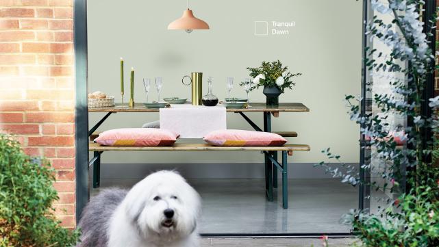
Green
This one is fairly obvious. We’ve seen this look across the board in life – in our fashion, our décor, colour schemes. And there’s a reason why. This is an extremely tranquil, soft shade of green. Focusing on bringing the outside in, lots of us have gravitated towards various shades of green this year in an effort to create a natural, plant-inspired haven when our outdoor lives became limited to our travel restricted area.
This calming sage colour, however, is one of the most common green tones we’re seeing cropping up in interior design. Rustic and cosy, this looks good against antiques and especially in kitchens, bringing a calming cottage and countryside aesthetic to any space. Welcoming warm and relaxing, this is a trend we can see sticking around for a while.
Earth tones
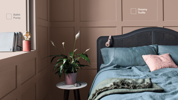
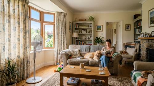
Again, natural and calming these shades are all about connecting you with the natural world. They can vary from dark to light, from creamy to deep brown, but the most important thing is that they make you feel relaxed. These kinds of shades are becoming popular in bedrooms and living rooms, as now more than ever, the home needs to be delineated, separating the working space from the places of relaxation and family life.
These earthy tones look best when complemented by natural textures, rattan, metallic tones, grainy wood. The ambience builds when all the different tones are brought together, creating a soft, rustic and relaxing landscape.
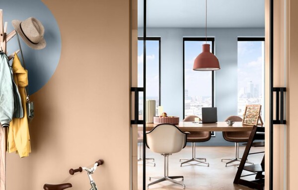
Blush pink
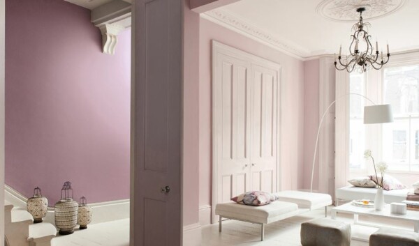
A quote that’s circulating around interior decorating blogs right now is that blush is the new white. The soft, pale pink has been transformed into not only a staple, but a new neutral. Gone are its associations with children’s bedrooms, blush pink adds an element of sophistication when offset with the right coordinating palette of colours.
When paired with clean dark lines and pale palettes, it’s the perfect bedroom look for the chic customer and when offset with a darker, contrasting colour like the deep blue featured above, it becomes avant-garde, eye-catching and a whole feature of its own. Braver and more vibrant than your true neutrals, this is a risk that can be daring and fabulous when pulled off properly.
Dark tones
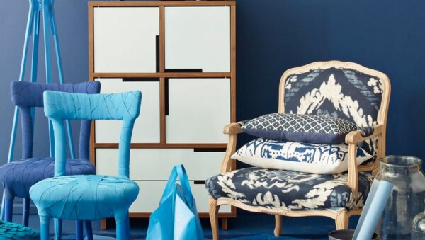
Did we ever think we’d see the day when we’d be painting our living rooms black or our dining rooms navy? I don’t think any of us saw this trend coming, but we’re loving it. The look pairs deep, dark colours with big blocks of light to create contrasting spaces that make our focus shift. Deep navies, charcoal greys and even deep khaki green are all making appearances in these colour palettes, increasingly popular in kitchens and sitting rooms.
Dark kitchen fitting contrasted with a pouring of light is all about the finish of the paint. Keeping the darker colours to gloss or satin finishes mean that the light available isn’t muted and creates a moody, dramatic look that is a true statement. Stylish and timeless, it’s important to keep the walls relatively bare to allow the colours and clean lines to speak for themselves and avoid making the room appear to shrink.
Dulux Colour of the Year 2022

Every year, Dulux colour experts translate global design trends into the new Colour of the Year. The shade for 2022 is Bright Skies™. It's an airy and fresh tone that opens up and breathes new life into any space. Discover how you can use this transformative shade, plus its four complementary colour palettes, to reinvent your home.
Jewel greens
Expressive and luxurious, this colour is making a major comeback. It evokes glamour and looks especially good with the dark and light trend, making a dramatic background pop against its brightness. The trend is in keeping with the emerging style of drawing inspiration from 1920s parlours.
Old-world glamour is making an appearance in the antiques and opulent ornaments lining the shelves and walls of living rooms. This bright tone hearkens back to that charm and prestige that oozes from the look, complemented by burnished golds and bronzes.
There is so much choice out there right now, whether the trend is something you want, or you’re looking for something of your own making, all you have to do is get started.
If you’re looking for advice on colour schemes and trends, you can find out lots more here and you can purchase Dulux testers here.
And there’s the super handy Dulux Visualizer App that allows you to see the colours on your wall before you make the leap click here Android and here for iOs.
Brought to you by